I have fought with Calibre-Server book reader for a long time. The ability to use any web-browser to read my e-books and have it sync my position and annotations is a unicorn I’ve been chasing for a few years. I always end up looking for alternatives because the web reader seems to be so inconsistent.
Since I always seem to come back to it, I’ve decided to keep a running list of various settings and stylesheets I’ve found effective.
One thing about the reader that I’ve discovered is that you have to configure it on each device you use. None of the style or preference settings are saved in the app. Accordingly, you’ll probably want different settings and styles for each browser/device.
Naming Conventions
To avoid confusion between the apps compatible with Calibre, I’ll be using the following terms in this document:
Calibre App
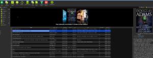
This is the Calibre program itself, most often represented as a grid with rows of books and columns representing the metadata in the books. It is possible to read books from this app by right-clicking the desired book and clicking ‘view’
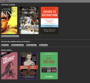
Calibre Content Server
This is the web-base reader that comes packaged with the Calibre App. It is disabled by default. You can enable it by clicking Preferences → Sharing → Sharing over the net in the Calibre App. The Main tab is where you can configure the Content Server to autostart, what port to listen on and what user accounts for access.
Content Server Settings
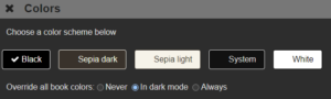
Colors
For a darker theme, make sure to check: Override all book colors: In dark mode
Page Layout
Maximum Screen Area
On the Page Layout screen there is an option to set the useable area. It defaults to the entire screen. Luckily, it also displays the current useable area. I always set the useable area to something slightly smaller than the maximum (especially on mobile) to avoid text running off into the page gutters:
Example: on my desktop browser:
Change the maximum screen area (in pixels) used to display text. A value of zero means that all available screen area is used. Current window width is 2517 and height is 1301 pixels.
I’ll enter 2500×1250
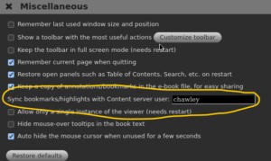
Miscellaneous
When opening a book enter fullscreen:
I select Always on mobile devices since I’ve found mobile browsers to sometimes have issues with text margins causing the text to run off the right or bottom of the page. The default setting of Auto is usually fine elsewhere.
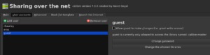
Accessing the server from anywhere on the internet
Before doing this you should turn on username/password protection in the Calibre App, otherwise anyone in the world will be able to access your books. Go to Preferences → Sharing → Sharing over the net and enable the option to require username and password to access the content server.
Annotation Sync
If you use the Calibre Content server’s in-browser viewer, you can have the Calibre App sync its annotations with the Calibre Content Server.
Start by opening a book in the Calibre App and going to Preferences → Miscellaneous in the viewer preferences and entering the username of the content server viewer to sync with. Use the special value * to sync with anonymous users.
Content Server Stylesheets
There aren’t any pre-configured stylesheets, and I’ve only found a few user-submitted stylesheets.
This is the one I use the most, cobbled together from scraps I’ve found online.
@import url(https://fonts.googleapis.com/css?family=Bitter);
@import url(https://fonts.googleapis.com/css?family=Ubuntu+Mono);

body.calibre-viewer-paginated {
  font-family: "Bitter", "Ubuntu Mono" !important;
  text-indent: 2em !important;
  line-height: 150% !important;
  padding: 10px;
  word-wrap: break-word;
 }

p, p.footnote {
  font-family: "Bitter", "Ubuntu Mono" !important;
  padding: 3px;
  word-wrap: break-word;
 }

h1, h2, h3, h4, h5, h6 {
  font-family: "Bitter", serif;
  font-weight: 600;
  line-height: 150% !important;
  text-align: left;
  color: #ffcc00;
}

span {display: inline;}

img {max-width: 100%;}

hr {border: 2px solid; border-radius: 2px;}
Links
- Google Fonts – Serif
- MobileRead Calibre Forum (unofficial forum for Calibre)
- Calibre User Manual
I’ve also used this CSS, which was the basis of the one in the original post:
@import url(https://fonts.googleapis.com/css?family=Bitter);
html {
font-family: “Bitter”, serif;
font-size: 1.05em;
color: #92979f;
-webkit-text-size-adjust: 100%;
-ms-text-size-adjust: 100%;
}
body {
text-align: justify;
text-indent: 2em;
line-height: 150%;
background-color: #27323c;
margin: 0 auto;
max-width: 23cm;
border: 2pt dashed #27323c;
box-shadow: 0 0 20px #000;
padding: 1em;
}
h1, h2, h3, h4, h5, h6 {
font-family: “Bitter”, serif;
font-weight: 700;
text-align: center;
color: #d39151;
}
a {
color: #fdfd96;
}